6 Powerful Strategies to Create Stunning Microsoft Excel Charts

6 Powerful Strategies to Create Stunning Microsoft Excel Charts
Quick Links
- Select the Right Chart for the Data
- Include a Descriptive Title
- Use a Legend Only When Beneficial
- Choose Your Colors Wisely
- Brand Your Chart
- Keep It Clean and Easy to Read
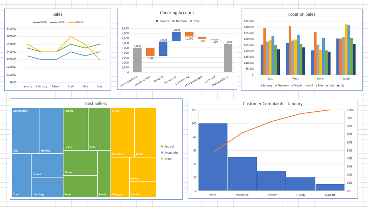
Excel makes creating a chart or graph easy, but there are certain things you can do to make your chart more effective. This list of tips can make your graph a successful visual display of your data.
Many of our guides to creating charts, like creating a treemap , offer essential customizing advice that often applies to that specific kind of chart. However, the tips you see here can make any graph stand out, regardless of the chart type.
Select the Right Chart for the Data
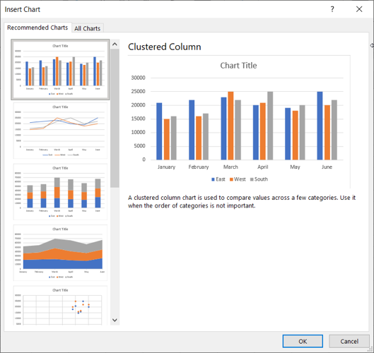
The first step in creating a chart or graph is selecting the one that best fits your data. You can gain a lot of insight on this by looking at Excel’s suggestions.
Select the data you want to plot on a chart. Then, head to the Insert tab and Charts section of the ribbon. Click “Recommended Charts” to see which types of graphs Excel believes fit your data.
You can also take a look at our helpful guide for finding the right Excel chart for the type of data in your sheet.
Include a Descriptive Title
While a chart’s job is to display your data so that it can be clearly understood, you also want to include a title. This is especially important if you plan to share the chart as an image on its own in an email or social media post.
Related: How to Save a Chart as an Image in Microsoft Excel
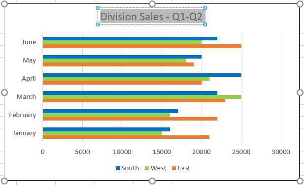
For instance, maybe you have a chart of first-quarter sales for your east coast division. Using a title that simply says “Sales” isn’t nearly as descriptive as “East Coast Sales – Quarter One.”
Excel adds a default title to each chart you create, but you can change it easily. Select the chart and then click the default Chart Title text box. Then just type in your own title.
Use a Legend Only When Beneficial
If you have a chart where a legend helps the viewer understand what they’re seeing, then you should definitely use one. But if your graph is clear on its own and there’s no need for a legend, remove it so the view is less cluttered. Let’s look at an example of both.
In the column chart on the left, you see colored columns and dollar amounts. But what does each column represent? By adding a legend, everyone has a clear picture of the data.

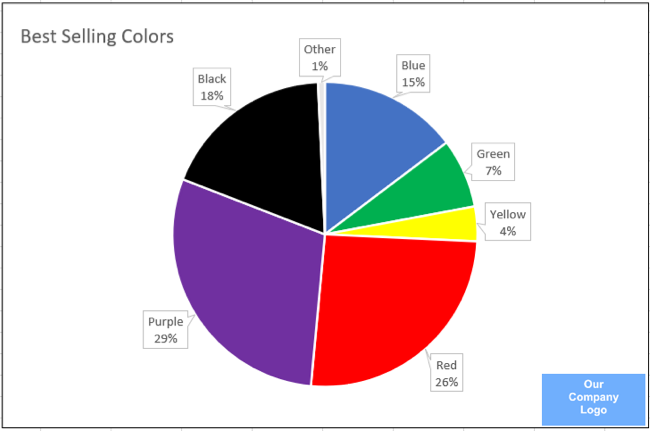
In the pie chart on the left, you can see each slice represents the color and there are data labels to confirm that. For this type of situation, a legend is an unnecessary distraction.

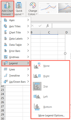
You can also position the legend in a different spot than the default location. Select the chart, go to the Chart Design tab and click the Add Chart Element drop-down arrow. Move your cursor to Legend and pick a location for the legend in the pop-out menu.
Choose Your Colors Wisely
Most any type of chart in Excel uses some color. Whether it’s a pie chart with different colored slices or a scatter plot with a handful of colored dots, you’ll have color to distinguish the data. Luckily, Excel applies a color palette that you can customize.
Related: How to Make a Pie Chart in Microsoft Excel
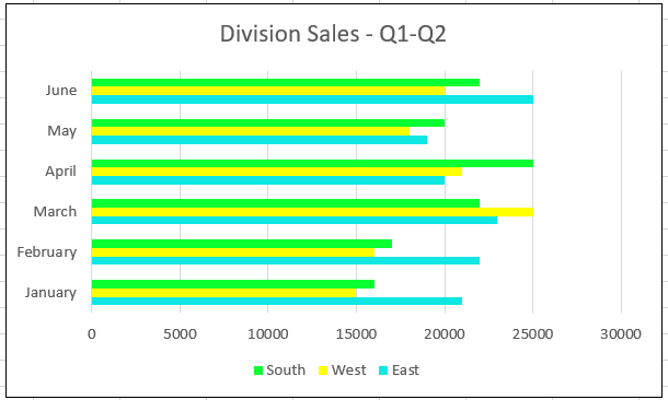
In the bar chart below, you can certainly see the colors pop off the chart. Unfortunately, it looks more like a box of highlighters than a depiction of sales.
By using a standard Excel palette, our bar chart not only is simple to read but also doesn’t give you a headache.
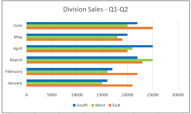
You can customize the colors any way you like; using your organization’s colors is a good option. The key is to be sure you choose colors that are pleasing and also contrast one another.
Related: What Is a Hex Code for Colors?
Brand Your Chart
One thing that’s often overlooked when making a graph in Excel is also the one thing that can make your chart distinctive. That’s branding. You have a few different ways to brand your chart so that it’s clearly yours but doesn’t distract.
Related: How to Make a Graph in Microsoft Excel
Add Your Logo
If you can add your organization’s logo to a corner of the chart, this is the simplest way to brand it. That small logo lets everyone know who the data belongs to.
Brand the Title or Subtitle
Earlier we mentioned including a descriptive title to your chart. If using a logo creates too much clutter, consider simply adding your company name to the chart title or even as a subtitle.

Keep It Clean and Easy to Read
One final tip for creating a chart that tells the story of the data well is to keep it clean, simple, and easy to read. Don’t overcomplicate your chart with unnecessary elements.
Just like the earlier tip for only using a legend when it’s useful, the same can be said of elements like axis titles, a trendline , or data labels. For example, you may feel that data labels help by providing additional detail. But as you can below, those data labels, no matter where they’re placed, clutter the chart and make it difficult to read clearly.
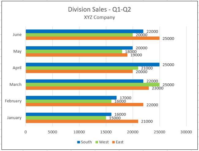
Instead, try arranging the data differently or even using another chart element. In the chart below, we added a data table rather than data labels . This allows us to display those additional details we want, but still keeps the chart neat and clean.
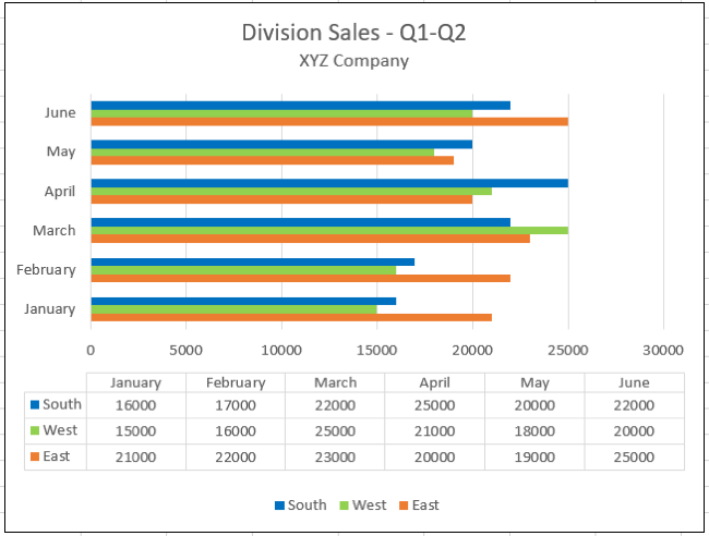
Hopefully these tips will help you create and customize a chart, such as a waterfall chart , that has a professional appearance and clearly depicts your data.
Related: How to Create and Customize a Waterfall Chart in Microsoft Excel
Also read:
- [New] In 2024, Trailblaze with Our List of The Top 9 Resources for Dynamic 3D Fonts
- [New] Social Strategies for Disseminating Health Information for 2024
- [New] The Blueprint for Building an Iconic Online Identity on YouTube
- [New] Windows Movie Maker Tips for YouTube Editing Excellence for 2024
- 「お問い合わせ方法 - 最新情報を知るために」
- About Realme Narzo 60 Pro 5G FRP Bypass
- FRP Hijacker by Hagard Download and Bypass your OnePlus Nord N30 SE FRP Locks
- In 2024, Best Ways on How to Unlock/Bypass/Swipe/Remove Lava Storm 5G Fingerprint Lock
- Overcome Limited Resources Alert – Now Functionality Restored
- Overcoming the Persistent Windows Update Issue: Error 8007000E Explained and Resolved
- Resolved GDRIVER_ERR#22 Issue
- Resolving the Troublesome 0xC19amo Update Error in Windows 10: A Step-by-Step Solution
- Reviving Stuck Keys on Your Windows PC - Comprehensive Fixes Inside!
- The Ultimate Guide on Acquiring Authorization From TrustedInstaller To Modify Files
- Title: 6 Powerful Strategies to Create Stunning Microsoft Excel Charts
- Author: Anthony
- Created at : 2025-01-19 18:10:55
- Updated at : 2025-01-25 16:45:40
- Link: https://win-howtos.techidaily.com/6-powerful-strategies-to-create-stunning-microsoft-excel-charts/
- License: This work is licensed under CC BY-NC-SA 4.0.